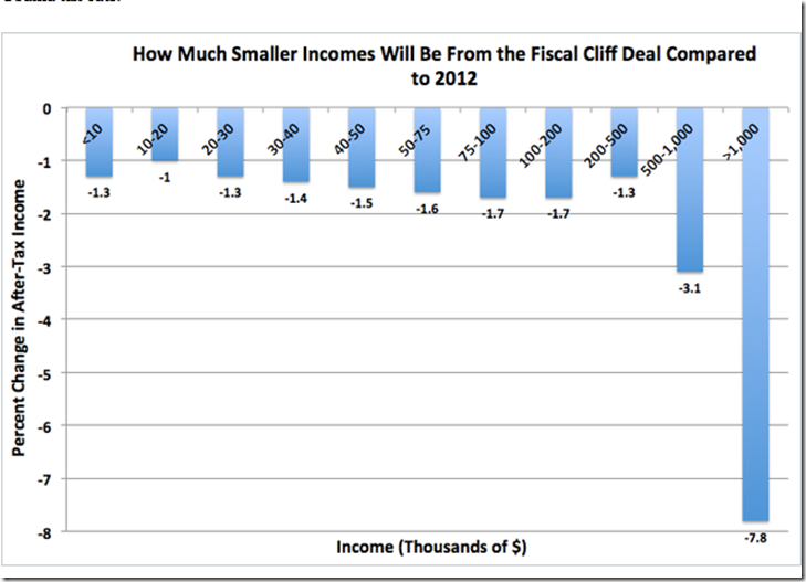
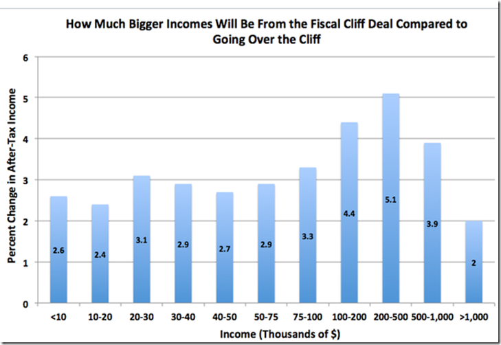
There are three big tax stories here, all adding up to modest tax increases for the bottom 99 percent, and much bigger tax increases for the top 1 percent.
(1) Five-year extension of the stimulus tax credits. The 2009 stimulus expanded the Earned Income Tax Credit, the Child Tax Credit, and the American Opportunity Tax Credit, and the 2012 fiscal cliff deal extended all of them for an additional five years. ….a big deal to households earning $20,000 and less. It's a safety net done the way conservatives like it, since households have to work to get these credits.
(2) Expiration of the payroll tax cut holiday. The worker's half of the payroll tax had been cut two full percentage points, from 6.2 to 4.2 percent, the past two years. Now that's over. …
(3) Return of Clinton-era rates (or more) for income over $400,000/$450,000. …..The deal also brought back limits on deductions and exemptions for high-earners, known as Pease and PEP, …..capital gains and dividends -- rates rise from 15 to 23.8 percent, with the last 3.8 percent due to the Obamacare surtax, for individual/joint filers making $400,000/$450,000. Remember, the top 0.1 percent of households account for half of all capital gains, so this is no small thing
Click on the following to read all of the story: These 2 Tax Charts Tell You Exactly Who Won the Fiscal-Cliff Deal - Matthew O'Brien - The Atlantic


No comments:
Post a Comment